Mobile Banking App Design
UBA Mobile Banking App Redesign
COMPANY
UBA
ROLE
UI/UX Designer
EXPERTISE
UI/UX Design
YEAR
2025
Project Description
This redesign project aimed to improve the overall user experience and visual appeal of the UBA mobile banking app, addressing major friction points in its onboarding flow, transaction process, and interface aesthetics. The goal was to create a cleaner, faster, and more intuitive experience that reflects modern user expectations for digital banking.
Project Details
Client: Conceptual redesign (UBA)
Role: UI/UX Designer
Tools Used: Figma
Timeline: 1 week (July 2025)
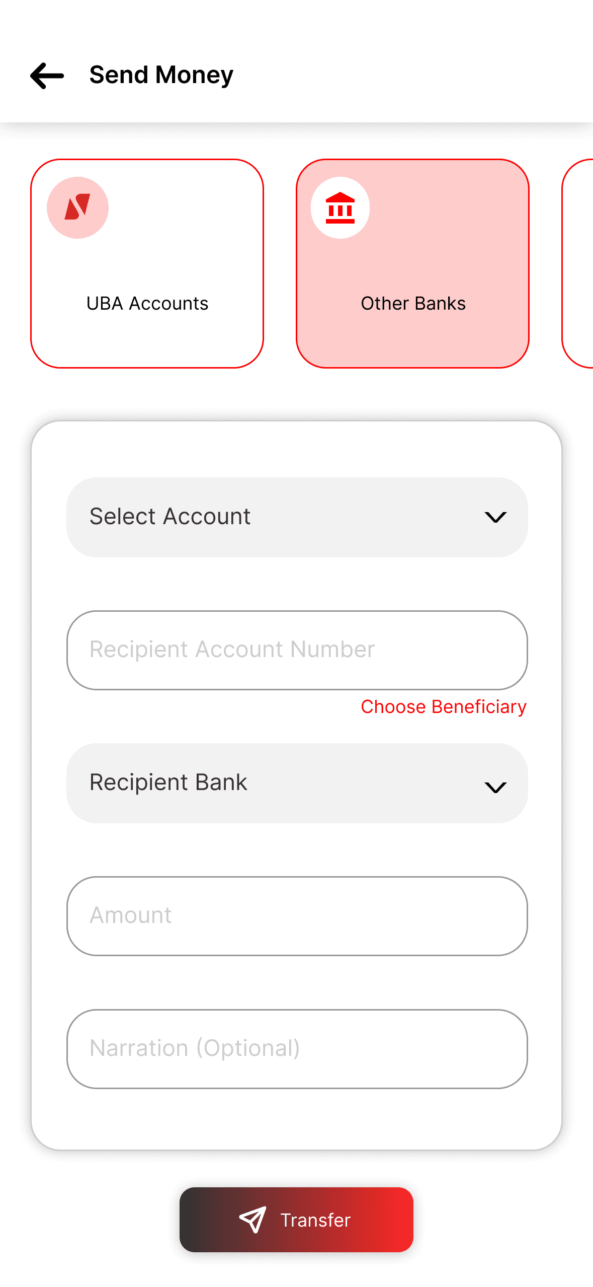
Scope: Mobile UI redesign – onboarding, dashboard, transfer flow
Background & Objective
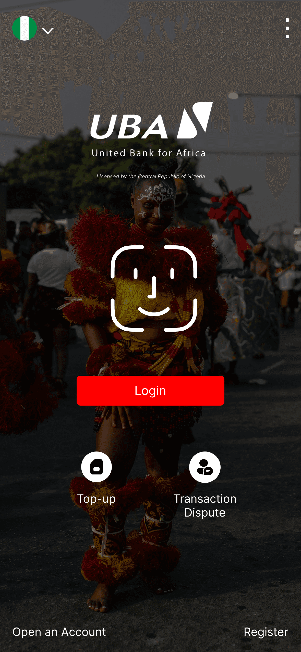
The original UBA mobile app had several usability issues:
A long and confusing onboarding process that increased user drop-off
A dated, cluttered UI that didn’t reflect the bank’s brand potential
An inefficient user journey from login to core features like transfers
The objective was to create a UI that’s visually modern, streamlined, and optimized for fast, low-friction use — especially for core actions like logging in, checking balances, and making transfers.
Process
1. Research & Audit
Conducted a heuristic evaluation of the current app
Compared UX flows of competitors like OPay, GTBank, Kuda, and Access More
Identified friction points in onboarding, navigation, and transaction flows
2. Wireframing & User Flow Mapping
Rebuilt the onboarding flow with fewer steps
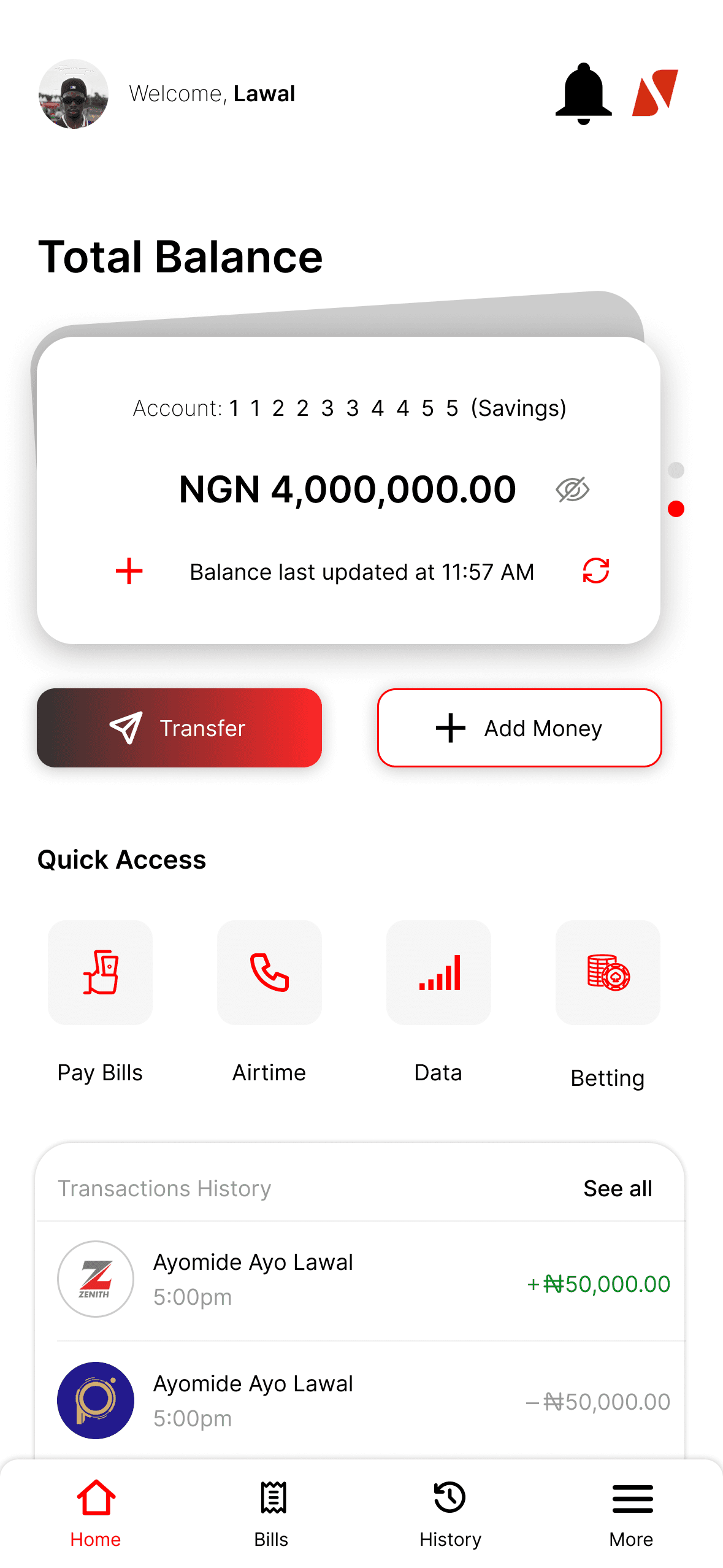
Reorganized primary navigation with tab-based structure to surface key features upfront
3. Visual Redesign
Introduced a clean, flat UI with modern icons, accessible typography, and brand-aligned colors
Used white space and consistent spacing to improve readability and reduce cognitive load
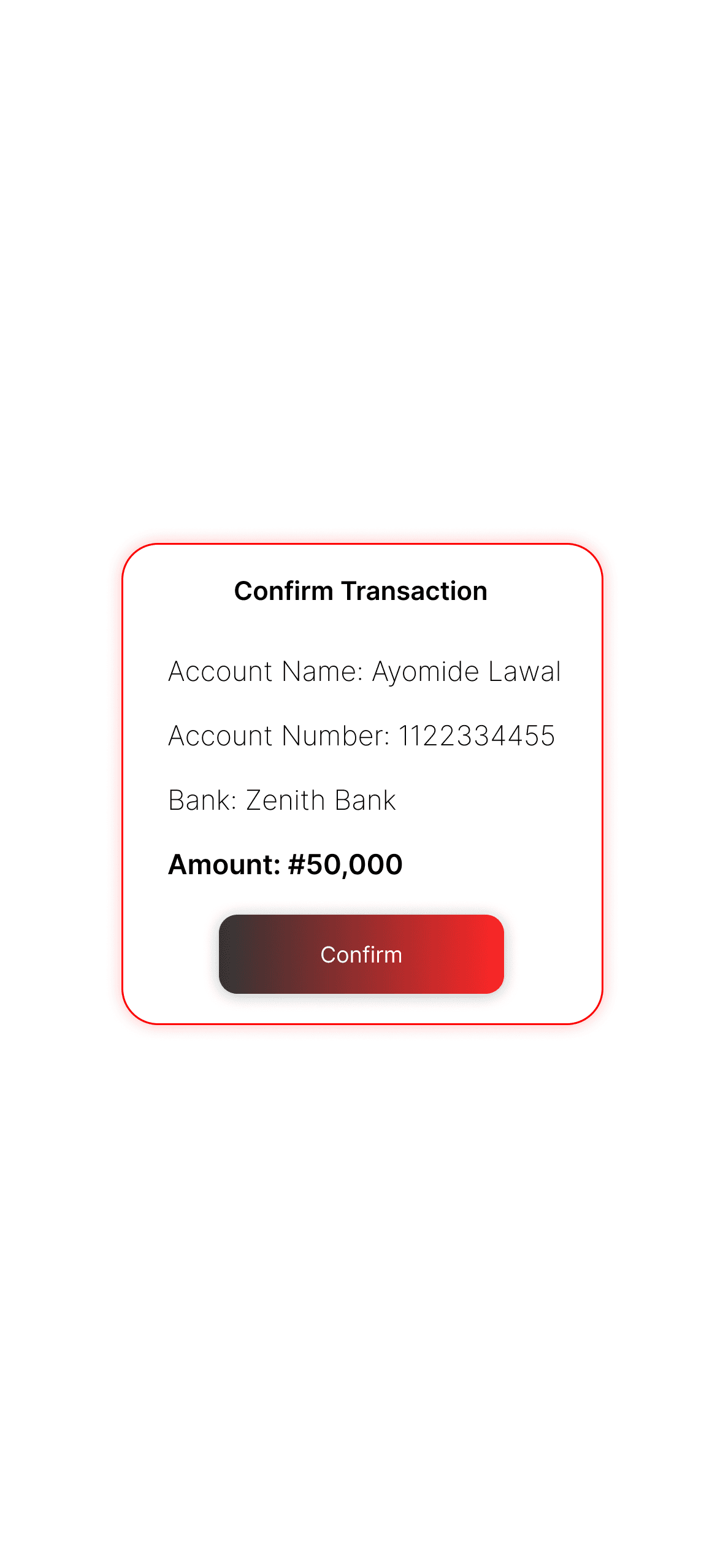
Simplified transfer and dashboard screens to focus on efficiency and clarity
Solution
The redesigned UBA app offers a visually modern and user-friendly interface that shortens the path from onboarding to transaction. The updated flow reduces complexity, eliminates unnecessary steps, and improves navigation by prioritizing the features users access most. The result is a cleaner, faster, and more intuitive digital banking experience that aligns with user expectations in 2025.
Results
The new design addresses critical UX issues and enhances the app’s appeal and usability.
Key outcomes:
Improved Onboarding: Reduced the number of onboarding steps by 40%, resulting in a smoother user introduction.
Modernized Aesthetic: The new visual design feels clean, current, and more trustworthy — aligning better with UBA’s brand positioning.
Faster Task Completion: Reorganized flows allow users to initiate transfers, view balances, and navigate dashboards in significantly fewer taps.
Increased Accessibility & Readability: Use of hierarchy, spacing, and color contrast improves overall clarity, especially for users on the move.
Competitive Edge: Brings UBA closer to the design and functionality standards of top fintech competitors, improving user retention potential.